
Brand Workshop | Brand Strategy | Naming | Logo Creation
Verdad Real Estate & Construction is a company that prides itself on providing unmatched services to its clients. Founded in 2009, Verdad is known for its open-book approach to business, and its core value of transparency is reflected in the name, which means "truth" in Spanish.
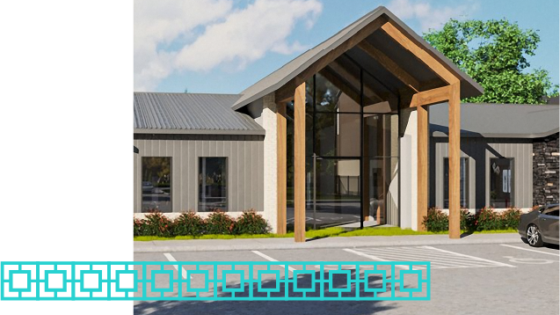
To date, the brand has primarily focused on retail and self-storage developments, but was looking to expand and make its first jump into the multi-family housing market. In order to do this, that new venture needed a name. That’s where the Serendipit team came in.
The Goal
The objective was to create a brand that would reflect Verdad's core values while expanding into class-A suburban sub-market sites and appealing to their target market of young professionals and families seeking high-quality living environments.
The brief directed the brand to be both authentic and adventurous, one that evoked positivity and that, through total honesty and transparency, let future residents know exactly the quality of product they would be getting and the high-quality life they would experience.
The Naming Process
To begin the project, we brainstormed an extensive list of potential names—and we mean extensive—along with modifiers and variations to help us make selections that would make the name more memorable and meaningful. We researched Verdad's brand values and target market and ensured any options presented to the team were available for domain acquisition with no glaring obstacles. We also conducted a preliminary trademark registration search and confirmed that none of our concepts conflicted with any existing brands in the market. This way, nobody fell in love with a name they couldn’t have. Then, we presented several rounds to the client, repeating this process with each round.

The Result
Establishing a final name was very collaborative. The Verdad team shared some initial ideas to help us understand their vision and determine a direction. Those ideas inspired many of the names we presented in each round, and as we presented those concepts, the wheels turned and inspired some new variations among the Verdad team. In the end, through ongoing brainstorming and collaboration, the final name selected by the Verdad team for their new multi-family housing line was: Avera.
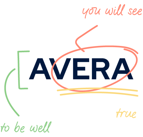
Avera combines elements of Verdad's brand name, its meaning of truth, and the core value of transparency, while also conveying the concept of well-being and personal qualities such as independence, adaptability, honesty, patience, and leadership. Avera as a name derives from the Latin word avere, meaning “to be well.” It also incorporates vera, which translates in Spanish to “you will see” and Latin to “true.”
In the end, Avera emerged as the best option for the overarching vision of the project. It perfectly encapsulates the company's core values. It reflects the concept of well-being that the team sought to convey and also conveys a sense of comfort, excitement, and adventure. Avera represents a significant milestone in Verdad’s journey, and we’re proud to have collaborated with the team to bring this vision to life.
The Logo Process
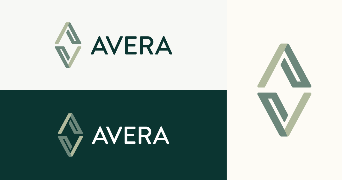
The next step after naming was creating the look of the brand—starting with the logo. In meeting with the Verdad team, we established the style of Avera to be bold and clean while ensuring that the look reflected the premium quality of their communities. With a densely populated multi-family housing industry, it was also important to the team that the Avera brand feel original and timeless.
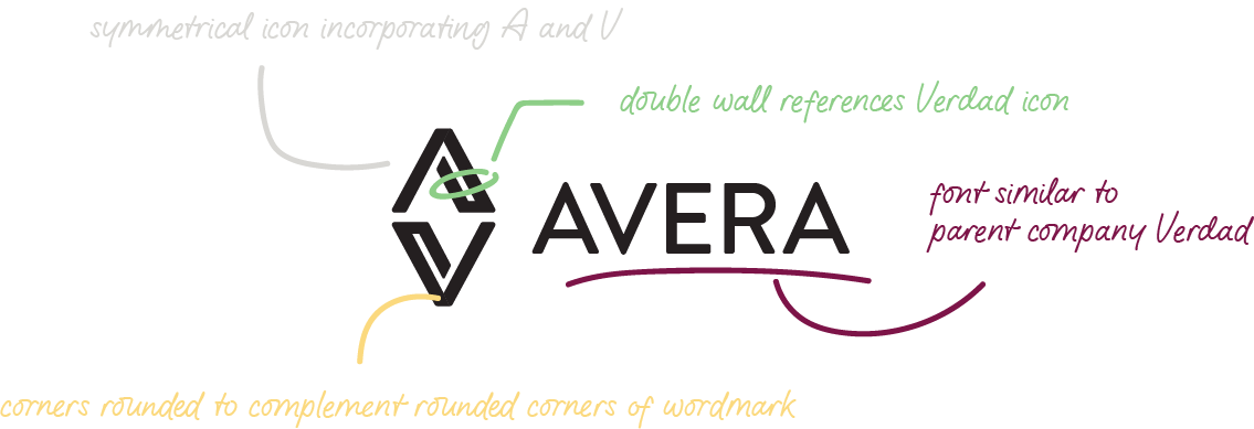
One of the initial aspects that intrigued our team was how the letters “A” and “V” contain angles that are direct mirrors of one another and how we could use those angles to create a memorable mark that hit some of those key style points that the Avera team was looking for.
The Result
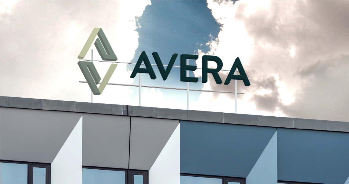
The logo speaks to all of the elements of the Avera brand name, with its straightforward yet visually dynamic icon.
The mirrored nature of the A and the V serves as subtle inspiration for residents, as Avera offers amenities that allow for both inward and outward reflection. The type was carefully chosen due to its rounded corners, which speak to the approachability and comfortability of Avera.
Avera represents a significant milestone in Verdad’s journey, and we’re proud to have collaborated with the team to bring this vision to life.
"The team was wonderful to work with. Everyone was very friendly, responsive and had great ideas. We appreciated their consistency and openness to collaborating with our team."
—Bailey Glazer, Verdad Real Estate & Construction
